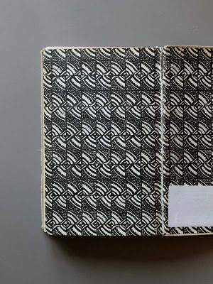
I started then to look more directly at calligraphy; in particular using this little book, Wie Schreibe Ich Schrift (1961), by Sigmund V. Weech (see earlier post on Wie Zeichne Ich Schrift; long-term loan back to you this week, Josh!).
Aside from enjoying the potential — in the way that the calligraphy herein keeps some kind of faith with geometry despite the hand — it struck me that the nib stroke angle which determines everything, is right-handed. This seemed the case everywhere. I picked up a photocopy of Edward Johnston's beautiful Foundational Hand at St. Bride's, which gave an angle of 35º, for the right hand. I am left-handed. Recollection a of teacher turning my hand and wrist to stop me push-writing over the top, to find this angle. So, the calligraphic Make Do was underway and then it occurred to make a partnering left-handed version.
The novel is suffused with gaucheness, in Pip's desire to shed his own and his mortification at Joe's visits to London. The heavy-handedess of Make Do; my own patchworked typographic knowledge. Leftedness. A gaucherie. So, Make Do Droite and Make Do Gauche were used in tandem, alongwith a new monoline discussed below. The idea was to reflect Pip's stage of narration, looking back at the events and his own folly, with the benefit of hindsight.

Had this photocopy for a long time, part of a box of typographic treasures passed on by mentor David Strickland. Make Do's stroke angle is stubbornly 45º. But I'd like to come back to these more. Also, the implications for drawing devices, in conjunction with templates. Been thinking recently about direct drawing jigs, as a way of making anthopometric studies for ROLU's chairs. But that's another post. Quite fascinated by stroke terminals and how they totally change the character — also the relative doubt or smugness — of a drawing. Also the mimetic pen tools in Photoshop.


Some more pages from Faces Borders Ornaments. Lovely, inconsistent old face and below, the first of a set of early sans serifs. I thought the name 'Great Primer' referred to the typeface itself but it seems it's more specifically to do with the large woodblock forms. Two sans serifs emerged. Caslon's Two Lines English Egyptian (emerging in about 1816)and Figgins' Two-Line Great Primer Sans-Serif (version I saw from 1847).
I wanted a set of caps for names and headings — so these sans-serifs inspired the set — but then a lower case which had some other quality in order to also deal with the monospace. It sounds convoluted but the story began to remind me of 1980s American Dream / Rise-Fall-Rise films, like The Secret Of My Success (above) and Working Girl. So, the slab-serifs are nodding to Susan Kare's 1984 Apple classic Monaco. With also some odd, oblique strokes to retain something calligraphic.

So in the clipping here and the ones below, what I hope can be seen is the way that the three mutations swap monospaced place, to nuance the text — in the droite and gauche cases — between the objective and the first glimpses of his pretensions.
 Edward Johnston quickly looms, as soon as one starts to read of calligraphy. Inspirational, influential and somewhat intimidating, in his assertions regarding standard forms. I have to admit a liking for the disproportionate 'B's, shown on this 1906 work, via Ellen Lupton's great site.
Difficult, though, for someone coming from an imagemaking schooling, to ignore the question — in the C19th light — of ornament. The key here for me, is the way it can occupy a space between words and pictures; between typography and illustration. Not one or the other?
The same book shuffled between scrollwork such as this and some early C20th slash-hatchings and Deco optics.
Then this, which resonated. A cobweb-eyelash lacework border, speaking to me of Ms. Havisham's rotting cake. Also, adding to a collection of splayed line motifs I've been collecting, as something that can signify optimism and aspiration (think sunbursts on the gable end of Irish bungalows, or the 'nice view' icon on Ordnance Survey maps) or oppression and deprivation (as below).
These security grilles, from the to-be-demolished Heygate Estate, London.
So the potential of ornament to be free of the over-explicit pictorial thing asked of book illustration, in order to carry something more abstractly to do with tone of voice, or the reader's reading. Inflecting, rather than stifling, the text. I think that illustration can do this. But it's not asked of it often enough.
The 'C H A P T E R 1' letterspaced here, in Victorian manner, starts to feel a bit like Copperplate, which I quite dislike. But also bringing the 1980s again (when I saw it a lot); so I left it.
The cobweb motif bookends the passage and looks to the future, the next page. The disappearing road trope does something similar, also setting some scene of the Kent marshes. But certainly each motif was meant to be stylistically a little inconsistent, with this one carrying the kinetic cheesiness of motorhome graphics, with their alto-sax aspiration discussed in a previous post.


