03/10/2012

Pressed up to the page


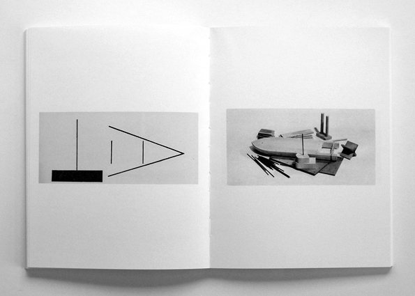
Four projects have come to a head at more or less the same time, hence the post silence. This — seen here in sequence and entirety (albeit with the spreads split) — a two-colour bookwork in edition of 300 for Container Corps of Portland, Oregon– in their 'Summer Sigs' series of publications by invited artists. The only stipulations were size (8.5" x 5.5"), page number (16), binding (saddle-stitch) and the inking (black, plus a chosen spot colour).

A number of influences behind the work. I was taken by the format. Harking back to the Make Do Type work for the New York Times, the benefits to working with imperial units have become apparent, really because of the fit to type measurement. This, in the knowledge that I will soon be making some letterpress work on an offset proofing machine, to feed an upcoming talk at St. Brides in November.

So the first move was to implement a square grid that would tally with the 8.5" x 5.5" page. Therefore, a 51 x 33 pica grid. Then, the notion of a book-object, with a system to hold moveable, concrete components. I am wary of the pegboard cliché but could see no other way as simple-stupidly flexible enough in this instance, to do what was intended.

This spread in sequence, from Quentin Fiore and Marshall McLuhan's The Medium is the Massage (1967) (via), has been an important one for use in my teaching of bookwork–based projects. The possibility of reader's thumb pressing and puncturing the epidermal page. In either direction. On another page, McLuhan speaks of "information being brushed up against information". So I was interested in squeezing the photopictured compositions up against the undersurface of the page, making the mediating skin as 'thin' as possible, under the reader's thumb. 

I had heard the erudite Sam Winston talk a couple of years ago, about his piece Pencil Drawing, being photographed under a large camera-scanner, for minimum distortion across the surface of his original. In the absence of such kit, I built the spreads on plywood 'pages' (with bleed), then scanned layer by layer, to brush each part up against the scanner glass and therefore the point of focus. Then, a painstaking recompositing job onscreen, so that all was in focus. The result, oddly synthetic.

Daily inspirators Michael Dumontier and Joe Gilmore have both recently issued bookworks with a kind  of mute thingliness. A conversation between pages, without recourse to words. Above, Michael's Call Ampersand Response (2012), with Micah Lexier. 

Here, Joe's Void() (2012), a risographic, eponymous derivation of his peerless site.


Finally, a real find, from Printed Matter in NY, a couple of years ago. Stina Ekman's Gitter (1985); "an intuitive exploration into the number of sculptures contained within the cube 60 x 60 x 60".

I want to write more about the component-language of the new bookwork and particularly its role as a pattern planner. Also the forms' inflection, out of the now happening Jiggling Atoms physics project. Save for the next post.

05/08/2012

Montpellier: Camping, Cicadas, Cropping, Capsizing


We are just back from Murviel-lès-Montpellier, the holidayest of holidays, staying with the best of best friends. Escaped from a wet, cold London and now returned to a city going bonkers on Olympic TV but quite calm in real life. Straight to an opening of the 'Performance' show at Protein's Hewett Street Gallery, into a publication project for Container Corps and bending my brain around waves and particles for a collaborative project, 'Jiggling Atoms'. More on these and other things soon. Now back to the velodrome; have to admit a viewing addiction.

18/07/2012

Intelligent Asking

This, just finished and sent to be a part of Intelligent Clashing's 'Dream Shop'; in turn, a part of ROLU's epic residency at the Walker Art Center, Minneapolis. In Rhiannon's words, it's the shop she "dreams of opening", behaving as a "snap-shot of a current community of artists/makers/designers who operate and communicate online". It looks like she is bringing her unimpeachable curatorial eye to the 'stock', in the way she has gently specified or selected palette and material mix.

It has been a good opportunity to work through the first of an ongoing series of embroidered totes, presented schematically in a previous post. I'm using readymade bags in 12oz cotton canvas available colours. Down the line, the intention is to design and make the structure from scratch but I do also like exponentially adding worth through handwerk, to such a staple. A significant step is to have pre-punctured stitch holes so that I — as a stitch novice — could do it. It also bonds the project with the boxes and other pieces which owe a good deal to Friedrich Froebel's 'Gifts and Occupations' lineage through to the Bauhaus' preliminary exercises.

I'll collate more reference points in a subsequent post. This bag developed as a kind of sampler, especially within these bars. I feel encouraged by the reductive but glitched turnabout symmetry and gaudy, bubbly spurts. It's a little marker for Matt and ROLU, too, on technique to be carried through to the chair covers. Their Walker residency is looking somewhat exciting.

29/06/2012

ROLU v Habitat, Counterform, Rubber Hosing, Automatic Martian, Shed Extrusions

Habitat's original (pre-Graphic Thought Facility-home-is-where-the-heart-is) logo—two chairs facing; a table in between; a lamp overhead; shoehorned into walls and a roof—embedded itself alongside David Pelham's 'A Clockwork Orange' bookjacket as my first early 70s unwitting foretaste of a 'graphic image'. I dither over distinctions but prefer to think of it as an ideogram, because it encapsulated my parents' move from Victorian terraced Liverpool childhoods to a early marriage teak unit(y). The catalogues had genuine power in offering an idea of a life. I remember thinking of it in the same way as an early sighting of 'Mr. and Mrs. Clarke and Percy'. Anyway, it's ripped for this drawing as I continue to work with and on ideas for ROLU's chairs– this one 'Neu Ulm'. Some formal commonality placed these chairs in this Habitat space, which is drawn from flawed memory.


An essential quality of the Habitat logo, is the equidistant hemisphere of negative space that houses the dining arrangement in its, well, habitat. Counterform is the riding factor in much of my thinking about image and pattern, coming out of typography of course. I'm creeping the chairs into these speedy drawings in order to stockpile formulae for print, appliqué and embroidery onto fabric. Other themes will come into play but here I just wanted to go for the woodgrain that Matt so carefully orientates on each facet, when in ply. Certain chairs are also available in OSB and this drawing is one of a stack of very fast fillings of an A4, looking at, then away from, the Weetabixy surface to get some sort of abstraction.

So I liked the idea of the house hugging the chair. Led by the chair. The lean-to nature of ROLU's '+' Chair made for an italic house. Interestingly, the lean is just over 12º, the angle Adrian Frutiger suggests as correct for an italic typeface variant, in my current reading of Signs, Symbols: Their Design and Meaning (did he really design the late-90s edition's edition's jacket?).

After a long time away from it, I've revisited automatic writing as an inspiration too; here, for another take on OSB.


This automatic transcription of 'Martian' by the psychic—and muse to André Breton—Hélène Smith, precludes a further post on the subject and also links to a very interesting short piece of radio listened to last night, which featured Ingebord Brun's early C20th handpainted globes of Mars.

On the comic, elastic thought. Just discovered that the period and style of animation I've discussed before, best represented by Max Fleischer, has a name: rubber hose. Brilliantly summed up by the term.


Stills from Walt Disney Studios' The Plow Boy (1929), via.

Back on the tight-fitting house. Allan Wexler's Vinyl Milford (1994), with extrusions to house each archetypal piece of furniture, with the possibility of an empty room as result.

26/06/2012

Led by Hand

Bananas on Plywood.

Knees and Elbows.

Broken Coconut.

Bulges and Creases.

Wobbling Blossom. So, Marion Richardson's primary handwriting exercises are having a direct effect on the way I'm now working out pattern motifs for projects in hand. I normally tuck away drawings like these, as a development stage before much more worked versions but really now want the gap between intention and execution to feature more in finished work– for a bit more natural waver. Remains to be seen how this translates through to print, appliqué and stitch. I think I need to go more measured for the chair application, for harmony with the support object. Excited again by the deft wobble of Sonia Delaunay and others, to be discussed in the next post.