
20/07/2013


18/07/2013
Engrailed, Invected, Embattled, Indented

Imi Knoebel's Messerschnitte silkscreen print series (1977-93). I'm beginning work on a second collaboration with James Langdon (news on the first — Eastside Projects Manual Draft #6 — to come). Not too much detail at the moment but the context is a performance of sorts; and the work, a costume which part-transforms into an architectural model. At the moment, it feels productive to interleave and loop references, this time in a cycle of five.

Partition line variants with shield fields, from A Complete Guide to Heraldry (1909) by Arthur Charles Fox-Davies, with illustrations by Graham Johnston. The performed building of the 'model' may be considered a stratification. There is a correspondence here, between a geological-sequential and a municipal-hierarchical stack.

Untitled, undated (c. 1970) Běla Kolářová make-up drawing, as seen at Raven Row earlier this year. A gestural inventory, with some dialectic between angst and whimsy brought about by the use of make-up as medium.

The palette will (I think) pull on royal blue and yellows that argue between themselves – from hazard fluos to just something just shy of ochre. Black as line and punctuation point. This arrives out of melting in the pot Leipzig's civic colours (more explanation another time), a Scandinavian retailer, the notion of an 'away kit', hi-viz bib 'n' brace, yellow jersey,...

Nomograph for the prediction of a four-hour sweat loss, from cabin thermal environment studies by NASA. Performance, within constrained spatial, gravitational conditions and durations. Interested by the intimacy of this data, for something of a slow spectacle.

Imi Knoebel, again.

Monochromatic print process solution for heraldic tinctures – "the system of hatching used by Marcus Vulson de la Colombière, 1639", again from A Complete Guide to Heraldry.
 Běla Kolářová
The plastercasty redoubling of surface expression that comes with a one-colour anything product.
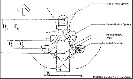
"Anatomical dimensions for the design of body waste management facilities", again from NASA.
09/07/2013
Susan, Sonia

Susan Bosence. "STRIPE and SPOT. (a) Combination of double wax resist twice brush dyed in Soledon blue and brown. Wax removed and paste resisted then brush dyed in dark blue on calico. (b) Wax resist spots, brush dyed in brown, paste resisted and brush dyed in blue. N.B. very labour intensive processes. 1960s."

Sonia Delaunay. "Project de tapis. Encre de Chine. 35 x 22,5cm."

S.B. "UNNAMED. Half grains of rice tied and dyed in indigo on silk. N.B. Susan sat sewing this length under a tree near Quir Bajou, her small house in France, one Summer. 1970s."

S.D. "Les Flèches. Encre de Chine. 1923. 27 x 21cm".

S.B. "STRIPE. Double paste resist, twice brush dyed in Soledon green and blue. 1960s."


S.B. "SPOT. Twice wax resisted spot, twice dyed in indigo and Caledon brown on fine cotton . (Alan Powers). 1980s."

S.D. "Projet pour une des premières publicité au Néon".

S.B. "UNNAMED. (a) Pin block wax resist dyed in Caledon red on poplin. (WSCAD 1983)."
Here, Susan Bosence and Sonia Delaunay, spliced. One offsetting the other, because this best represents how it is that a working clue can be taken on board — to do with the way treatment, animate hand, careful-careless touch can carry elementary (quite obvious) compositional forms — underneath simply regarding the influence of both.
The Sonia Delaunay drawings are taken from a curious 1978 book subtited 'Dessins: noirs et blancs' and pubished by Jacques Damase and 'Artcurial' of Paris.
The Susan Bosence samples were photographed during a visit to the Crafts Study Centre in Farnham, with a group of eleven friends squeezed in. I emailed (the generous and welcoming) curator Jean Vacher ahead of the day, to ask for a viewing of elements of the collection, such as Barron & Larchers' sample books and Lucie Rie pots.
It was wonderful of course, to feel the hand-weight of Rie's (and Hans Coper's) vessels, as well as to leaf through the aptly named 'elephant' volumes of B & L's samples.
But the revelation was Susan Bosence's sample catalogue. Difficult here to represent the bleeds against the pin-sharp edges but the technical descriptions give some idea of the painstaking skill required to arrive at such acuteness, nuance. I had been reading 'Hand Block Printing and Resist Dyeing' (1985) but not had the sense outside of the mentorship of Phyliss Barron, of what she was achieving discreetly.
A footnote. We also saw the exhibition downstairs of Robin Tanner's collection. He has been discussed, with relation to Marion Richardson, in a previous post. A small quote in the space: "As a boy I had two great longings — to be a teacher and an artist — and I have never wavered".
25/03/2013
Eastside Adhocisms


Studies for an in-progress collaboration with James Langdon, for Eastside Projects. James, in conversation with co-director Gavin Wade on "layering and counter-positioning" — with mention of the project — in the current issue of Cura magazine. More soon.
04/02/2013
Secondment, Progress


 In the throes of studio work, preparing 'Secondment', opening at Beginnings NYC on 21 February. More documentation, detail soon.
08/12/2012

07/12/2012


03/12/2012


Worrying Something Into Shape

A junction point, with the need to establish some logic for a larger set of works in fabric. Here in this space, I'm hovering too much over each sentence — each postable image — and enjoying blurted thoughts published elsewhere with a 130 character cap.
With a new body of work, the chance presents itself to grow a new arm – or flex an unused muscle. In this case, a different kind of mark made. I do not buy the thought that a measured line is less expressive. So this is not to find something more 'authentic' or 'characterful'. It's simply a self-adjustment. A different rhythm — some disturbance — across the surface of what is something edging towards pattern.
These are natively digital drawings and I do feel the tick to give them another texture which has more physical key. But they are what they are, even if I wince a bit, posting them. Because they are a means to an end, with the translation to appliqué, embroidery and print to come.
They have some quality I have felt when pinching clay. Worrying something into shape. Graphic hesitancy. That I do want to carry through into fabric. In tension with something more measured at the conjoint between the wobble of these marks and the templated stability of a support – be that a frame, a chair.
02/12/2012


Subscribe to:
Posts (Atom)

 Posts
Posts

